In 2022 having a business website is no longer a luxury – it’s a necessity. The good news is it isn’t expensive and with a little elbow grease you can DIY it. From Squarespace to GoDaddy, website builders are incredibly affordable and easy to use. With that said, if you’ve never built a website before you likely aren’t sure how to make it “look pretty”. And while looks aren’t everything, the aesthetics of your website play a bigger role than you might think in turning visitors into customers. So today I’ve got my Top 5 Design Best Practices for creating an effective, visually appealing website.
Consistent Branding
Your website must have consistent use of your branding. Your logo, fonts and colors will give your visitors a first impression that will keep them scrolling or make them bounce.
This starts with your logo being visible, but not the center of attention and sticking with your brand’s fonts and colors throughout the site.
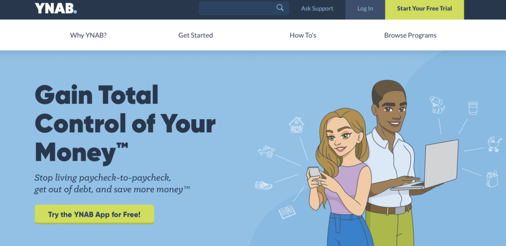
Take YNAB for example. You can see how their logo is on the top left in the header, they use a clean 3 color branded color scheme and fonts based on their logo that are easy to read.

Clear Call to Action (CTA)
Your Call to Action or CTA needs to be clear, concise and attention grabbing. Think about the one action you want a potential customer to take on a page and give them a clear button to do that.
You can see above with YNAB’s site it’s VERY clear they want you to start your free trial. Their CTA button is in the top right of the header and on the hero image in an eye-catching branded color – all best practices for CTA’s.
Visuals over text
Focus on the use of visuals in the form of photos, graphics, etc. verses relying heavily on text. When you do use text, keep sentences and paragraphs short – consider using bullet points when you can. People have short attention spans and want necessary information delivered easily, so use less text, make it concise and leverage images.
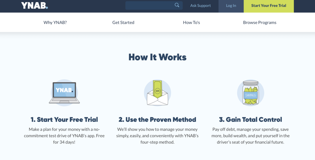
YNAB does this well with the use of graphics and illustrations. They also use short sentences allowing prospects to quickly understand what they do and get the information they want without being bogged down by text.

User friendly navigation
The key to designing an effective website is making it user friendly. Don’t make visitors hunt for information. Your navigation should be simple, organized and provide a menu of valuable information. Things like About, Services, Contact Us are great on a navigation bar, but social media icons need to be at the bottom of the page (you want visitors to stay on your site).
Also work with the standard horizontal navigation, instead of trying to get fancy. Consumers are used to seeing menu options at the top of the page.
You can see how YNAB keeps it simple with their navigation bar. They give you menu options that make sense and guide you to the information you need.

Optimize for mobile
Last, but not least, make sure your website is optimized for mobile. Most consumers these days are using their mobile devices to search online, so your site must be responsive on mobile. The worst thing you can do is have a site that doesn’t function properly on mobile and when a visitor lands on your site they instantly bounce off because it’s a nightmare to read and navigate.
The awesome thing is this is easy to do! Most website builders come with responsive mobile design, so it’s not difficult to nail this best practice.
Bonus tip: Be Accessible
Website accessibility means making your website usable to as many people as possible. Things like font size, color contrast and page organization can impact if people with disabilities or even those using a mobile device can use your website easily.
To learn more about this I highly recommend checking out my amazing graphic designer friend Andi’s blog “Is Your Brand Accessible?”.
Conclusion
Whether you are getting ready to build your business website or already have one, use these 5 tips to ensure your website is set up visually to convert customers. Implementing a few simple best practices will make your website an effective tool in your marketing arsenal. And if you want more tips on this topic check out this great article, “13 Website Best Practices for 2022.”
Need a business website, but still not sure how to start?
We are considering offering a hands-on Website 101 workshop to help business owners DIY their websites. If you’d be interested in this offering please let me know.


6 Responses
I could really use a tutorial on how to build a website. With what little I know now, that seems daunting. I have an Etsy shop, but I’d like something else. Thanks!
Hi Jane! You aren’t alone, most of us business owners feel intimidated by building our own website. I started on Etsy too and then moved to Shopify (our business is now on Etsy and has its own standalone site through Shopify). We will keep everyone posted through our newsletter when we launch a website workshop!
Will this be available online?
Hi Wendy! Our idea with the website workshop would be to have it in-person so it can be hands on.
Offering a hands-on Website 101 workshop to help business owners DIY their websites is a FABULOUS idea! Keep us posted!
Thanks for the feedback Kelli! We will keep everyone posted for sure!