Whether you’re hiring a graphic designer to create the look of your business or taking on the task yourself, the branding colors you use are an immensely important part of a successful business. With so many hues to choose from, it can be hard to decide on a visual direction. As a general rule, you’re going to be sticking pretty closely to the colors you pick for all of your printed materials, websites, brochures, packaging, etc., so you want to use the best color palette possible for the products/services you provide.
Here’s a guide to applying color schemes that are harmonious and take advantage of the different meanings behind colors.
Color Terminology
You’ve probably heard some of these phrases in elementary school, but let’s take a design-centered look at these color terms.
Primaries
Probably the most familiar to you, the primary colors are red, blue, and yellow.
Secondaries
Green, Orange, and Purple: these colors are created from mixing the primary colors.
Tertiaries
Tertiary colors occur when you mix a primary with a secondary color. Blue-Green, Blue-Purple, Red-Orange, Red-Purple, Yellow-Orange, and Yellow-Green.
Shades, Tints, and Tones
Adding any amount of black to a color makes it a shade, adding white to a color makes it a tint, and adding gray would make it a tone.
Chroma
How “pure” or saturated a color is (a bright royal blue would have a high chroma, whereas a blue-gray would have low chroma).
Value

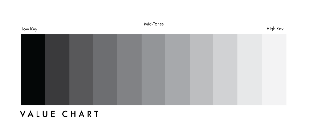
The lightness or darkness of a color– A high-key value would be a lighter color, whereas a low-key value would be a darker color.
Warm Colors
Warm colors convey comfort and passion. They’re primarily reds, oranges and yellows.
Cool Colors
Blues, greens, purples are considered cool and typically convey a sense of calm.
RGB color
RBG stands for Red, Green, Blue. This color system is used for screens, providing an intensity that isn’t achievable with physical media. When they are combined at full strength, white is created. The most common reason for you to use an RGB color system would be an app, website, or any other digital media.
CMYK Color
CMYK stands for Cyan, Magenta, Yellow, and Black (I know, it makes no sense for Black to be “K” but apparently it stems from old printing terminology, referencing “key” printing plates). These process colors are used in varying ratios for printed materials. As you can probably guess, you will be working within this color system a lot, for anything that you could ever print.
Hex Color
Hex color is another digital color system that uses a unique set of six letters/numbers (known as a hex code) to denote a specific color. It is essentially shorthand for an RGB color.
Color Schemes
Crafting a cohesive color scheme rather than randomly picking a hue for your next project is going to save you a few headaches. While there is room for experimentation, here are a few examples of ways you might structure the foundation of your color scheme.
Complementary
Complementary colors are directly opposite from each other on a color wheel– blue and orange, yellow and purple, red and green etc. These colors might look pleasing together, but can be very overpowering when used for branding purposes as they can “vibrate” against each other unless altered in some way.

Sometimes lowering the saturation/chroma or finding a tint/tone/shade of the colors will make them less potent. For example, using a sky blue with a burnt orange reduces the contrast. Using a “near complementary,” meaning a color and one adjacent to its complement can also lessen the visual vibration. A yellow and a blue might at times work better than a yellow and purple.
Split Complementary
A color and the two colors either side of its complement.
Triadic
Three equidistant colors on the color wheel.
Analogous

A color scheme consisting of colors adjacent to each other on the color wheel (i.e. yellow, red and orange).
Monochromatic

A color scheme based on one hue, but many different values or tints/shades/tones.
Example
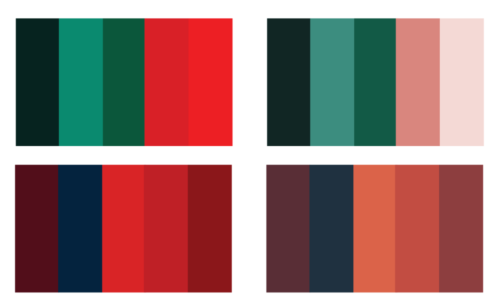
Look at these alternate versions below of two color schemes. The palettes on the right are tastefully balanced. The top right palette uses green and pink, near complementary colors– a low saturation pastel pink and a deep rich forest green, providing a variation in value that allows the colors to be used in a variety of ways. On the top left we see the same color palette but with the saturation turned up to the maximum, turning the pinks into shocking reds that vibrate against the greens and burn the eyes.

The same can be said for the bottom left and bottom right palettes: the terracottas on the right fit far better with the navy than the galvanizing reds on the left.
Both of these examples demonstrate that just because colors in theory are complementary or blend well together, they can easily be ruined by mistakes like oversaturation.
Color your Branding
So now that you have a better idea of what colors might look good together, let’s get even more intentional with our selection– see my post “Branding Your Business: 7 Tips You Need to Know” for more information on color meanings.
Say you’re starting a coffee shop– most coffee companies have branding that feels inviting, comforting, and warm. You could certainly go in that direction by going with soft browns, sage greens, or maroons with burlap textures. But say you want the brand to feel more peppy and invigorating– caffeinated if you will. You might go for a pastel, sunny yellow with a bright blue, conveying a sense of freshness and invigorating.
Choosing the right color scheme is the perfect marketing strategy for communicating your brand personality to your customer. Triggering the correct psychological response will help associate your business with the goods/services that it provides. If you’re a high-end fashion company, using more “sophisticated” hues that will stand out to your target demographic will get you a lot farther recognition-wise than acid green and bright purple. Getting your brand colors right is one of many steps you can take to help connect directly to your target audience.
Conclusion
Overall, learning the ideology and reasoning behind color usage is going to make your branding more purposeful, and make you stand out against the competition. Most people don’t stick around to read a manifesto, so the faster you get your message across, the better. With properly colored branding, you can convey exactly the mood you want and craft a far more professional business in the process.

