It’s hard enough to come up with a business plan and keep up with all the demands of entrepreneurship without stretching the creative half of your brain to come up with a killer logo as well. And while it might not be on your priority list when starting your business, branding is essential. The branding of your business is the first thing a potential customer will see– and as humans are visual creatures, it might be the only thing they remember. It can be beyond intimidating to look at an empty screen and have no idea where to start, and not everyone can afford graphic design services. So, here are some guidelines to help that blank canvas turn into the face of your business.
Use the Right File Type
There are two types of art files you’ll come across when creating your logo and branding – vector and raster. While both have their place in design, here’s why vector is your best choice.
A vector logo is made out of lines, shapes, and curves– based on mathematical principles and is infinitely scalable. Vector is often the best choice for logos and branding and most of the logos you see in the wild are in vector format (Google, YouTube, etc.) The best tool for creating vector art is Adobe Illustrator. It’s not cheap, but it is an investment that will pay off any time you need to create materials, printed or otherwise, for your business. You can also see free platforms like Canva, or Affinity Designer if you don’t want a subscription-based program.

Raster is a format you may be more familiar with, composed of pixels. The photos you take on your phone are raster. These photos are set at a certain dimension (1000 pixels by 2500 pixels, etc.) and become “pixelated” as you scale them. Because of this raster images are typically used as accents in your branding (stock photos, etc.) instead of being used as a logo.
Keep it simple
Sometimes the best solution is a simple one. You don’t want to assault your customer’s eyes with tens of shapes, colors and fonts. Do a case study of companies like FedEx, Apple, Nike, and Amazon. Their logos are simple, vector shapes that instantly communicate the brand’s “vibe” with subtle imagery connected to what the company does.
It helps to start with breaking down what products and/or services your company provides, then thinking of what objects, symbols, or ideas might be connected. Try to create a mark or icon that simply and clearly illustrates what your business does.
Sketch Your Ideas
Grab a sketchbook and make different iterations of your ideas. You don’t have to be an artist to benefit from sketching out your concept. The whole idea is to simply get some rough ideas on paper. Good ideas come with practice and repetition: the first sketch is never the best.
Looking on Pinterest for inspiration and making a board dedicated to your idea will also aid you in picking an aesthetic direction. The best way to learn is looking at the design of other successful businesses, and how they convey their brand ideology.
Use Color Theory
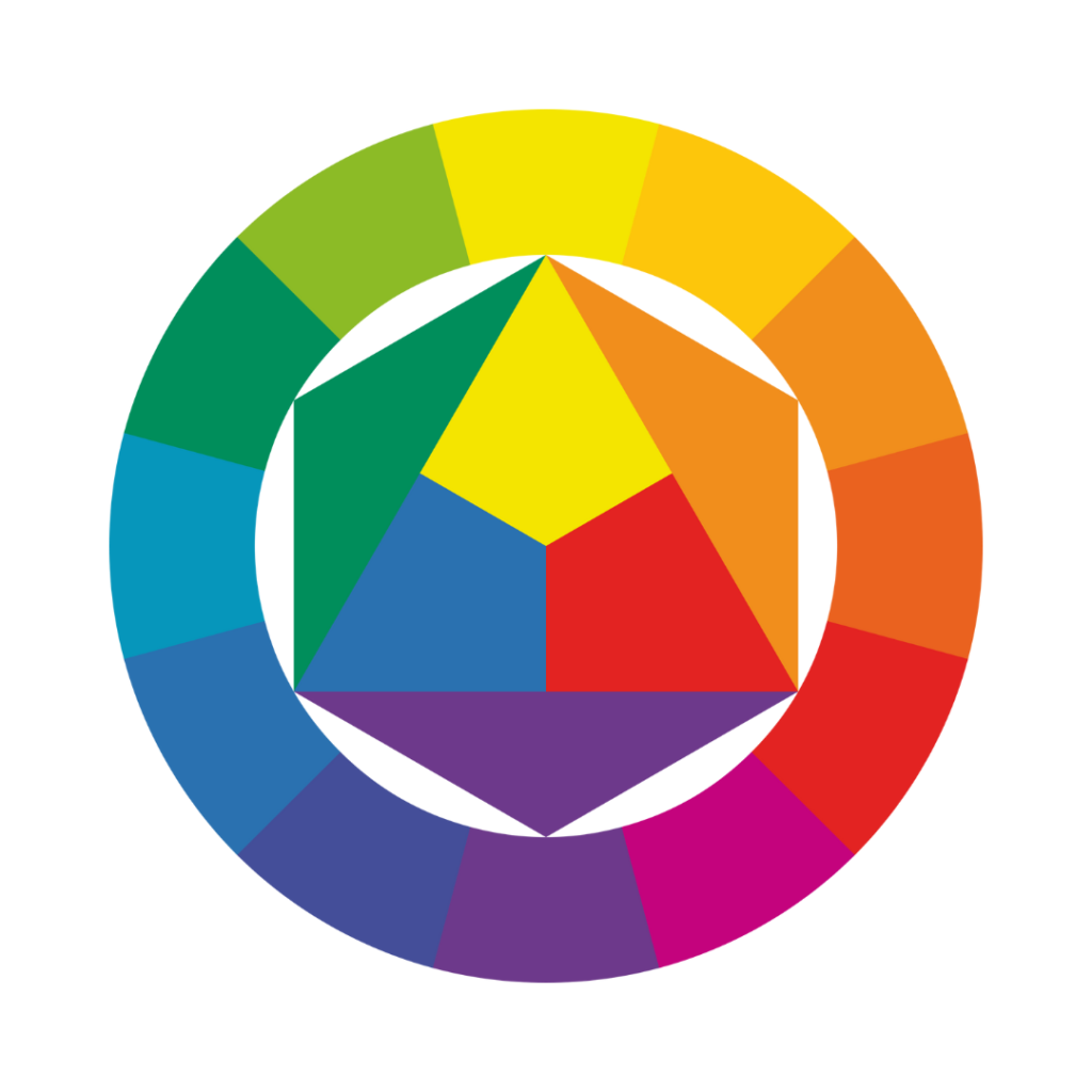
Color theory is the notion that colors can convey meaning and mood. Have you ever looked at a bright, sunny yellow and felt your spirits lifted slightly, or felt a sense of calm looking at a forest green? Colors have built in associations that can make a viewer think or feel a certain way. Take advantage of this concept when crafting your branding.

Here’s a few examples of what colors can mean:
Red: Passion, love, power.
Orange: Creativity, vitality, positivity.
Yellow: Energy, excitement, joy, enlightenment, optimism.
Green: Nature, health, growth.
Blue: Responsibility, calmness, trustworthiness, security.
Violet: Royalty, status, luxury, spirituality.
White: Purity, emptiness, peacefulness.
Black: Maturity, sophistication, mysteriousness, boldness.
Consider Typography
The font (or typeface,) that you use can convey meaning or a feeling as well. Some are funky and imply a relaxed attitude, some are minimalist and modern for a cutting-edge feel, and some are formal and luxurious. When picking a font, be sure it conveys the “vibe” of your brand. It is wise to use no more than 1 for a logo with rare exception, and preferably no more than 3 across all of your branding.
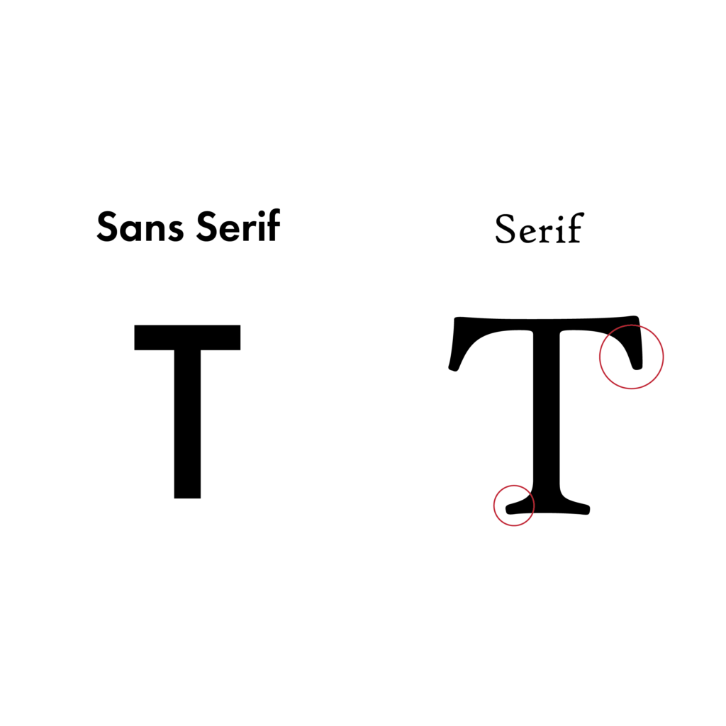
The two main categories of typefaces are Serif and Sans Serif.

Serif fonts
Serif fonts have little “feet” at the bottom of the letterforms, typically giving them a more formal feeling. Serifs typically have more variety than sans serifs.
Sans Serif fonts
Sans Serifs (sans being Latin for “without,”) are considered more modern, simple, and airy than serifs– anything from a technology company to a hotel chain, could use a sans serif font.
Get Feedback
Design is arguably subjective– some may prefer pastels and glitter while others lean towards a more unisex and minimalist approach. If you’ve been staring at something for too long, it can be hard to gauge what could use improvement. Get feedback on your designs from friends, family, and strangers if possible, especially those that would be interested in your company. Getting a sense of what people think of your branding is going to allow you to make changes that will guide your designs in the right direction.
Stay Consistent
One of the most important elements of branding is consistency. Once you choose some typefaces for your branding, using them across all of your materials is going to make you instantly recognizable and give you brand recognition like nothing else. The same rule applies to colors, which the average person can identify more quickly than fonts.
Conclusion
Overall, learning the basics of branding can help you DIY your branding. This will solidify your businesses’ identity and “feel” in the mind of consumers, making for a memorable aesthetic that will stick with them. Having solid branding will make you appear more professional and competent, standing out from the crowd of other eager entrepreneurs. Putting thought into the colors, imagery, and typefaces you use will also put you ahead of the pack. In short, learning even the basics of branding is going to put your best professional foot forward.

